
Color isn’t just decoration, it's communication. The colors on your walls play a bigger role than most people realize, especially in commercial spaces. They influence how customers feel, how employees perform, and how your brand is remembered.
Color psychology is the study of how color impacts mood, perception, and behavior. When applied to commercial interiors, it becomes a powerful tool for supporting your business goals. Whether you're refreshing an office, retail store, or wellness space, the colors you choose are saying something every day.
Let’s break down what those walls might be telling people and how to make them say exactly what you want.
What Is Color Psychology?
Color psychology focuses on how specific hues affect emotional and psychological responses. In commercial spaces, this concept helps business owners choose colors that support the function and feeling of each area.
Here’s how color can shape behavior:
- Blue promotes focus and a sense of calm
- Red brings energy and urgency
- Green encourages balance and well-being
- Yellow boosts optimism and creativity
- Neutral tones like gray, beige, and white offer flexibility and structure
When used intentionally, these colors can guide how people interact with your space without saying a word.
How to Use Color Psychology in Commercial Spaces
Match Color to Purpose
Every space serves a purpose. The goal is to choose a color that supports it.
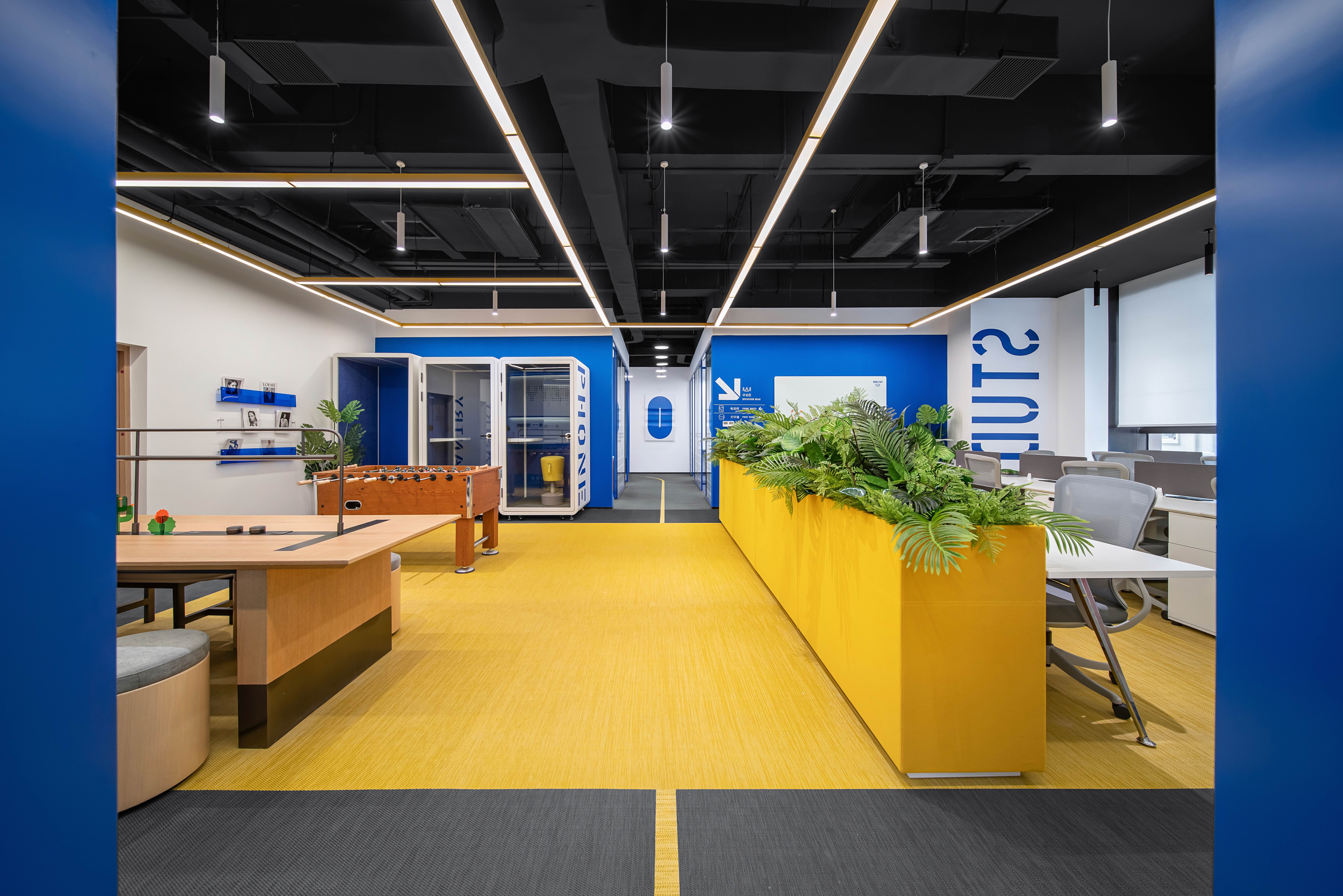
Office Environments
For focus and productivity, stick with blues and soft greens in work zones. Common areas like kitchens or meeting rooms can benefit from warm, energizing tones like yellows or oranges. For a more polished, timeless look, grays and taupes offer professional neutrality.
Retail Spaces
Use color to guide attention and influence emotion. Red creates urgency and can encourage quick decision-making but it’s best used in small doses. Soft neutrals build trust and allow products to stand out. Accent walls with branded colors can create strong visual impact and brand consistency.
Wellness, Healthcare, and Hospitality
Create calm, clean spaces with muted blues, greens, and off-whites. These colors help reduce stress and make guests feel comfortable. Harsh whites or bright neons should be avoided; they can come off as cold or overly clinical.
Accent Walls: Small Changes, Big Results
Not every color needs to cover every wall. In fact, accent walls are one of the easiest ways to bring color psychology into commercial design.
One well-placed wall can:
- Highlight a service area, product display, or entry point
- Create separation in an open-concept layout
- Reinforce a brand color in a subtle, intentional way
- Set the mood for a specific zone like a quiet lounge or active workspace
Accent walls also allow you to experiment with bolder colors without overwhelming the space. And when done by professionals, the finish is clean, crisp, and long-lasting.
Work With Professionals Who Understand Design and Function
Paint is one of the most affordable ways to influence how people experience a space but it only works if it’s done right. At Texas Professional Painting, we combine experience with insight. We don’t just paint walls, we help businesses make smart, lasting choices that support their space and brand.
From helping you select the right palette to delivering a polished finish, our team knows how to make color psychology work for you. Whether you’re updating a small office or refreshing a full retail floor plan, we’re here to make sure every color tells the right story.
Let’s Make Your Walls Work Smarter
Color psychology isn’t just theory, it's a strategic way to enhance how your space feels and functions. When used with intention, color creates better customer experiences, supports team morale, and strengthens your brand identity.
Texas Professional Painting is here to help you bring those ideas to life with expert service, high-quality materials, and results that last.
Ready to use color to your advantage? Let’s create a space that looks great, feels right, and works hard for your business.


